words // Zac Dubasik
When it was originally released in 1997, the Foamposite One made an instant impact. If the price alone – $180 – wasn’t enough to shock you, its groundbreaking design surely was.
Its carved and contoured upper inspired many conversations. I remember rumors about how this magical new material heated up, then molded to the shape of your foot. The design had so much impact that even though it may have lacked a large midfoot Swoosh, there was never a doubt that it was a Nike product.
 The Foamposite One design spoke for itself. All it took to turn heads everywhere was a solid color, and a bold design. It didn’t need large logos, and it most certainly didn’t need any type of print.
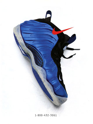
But then it got a logo. A few months following the release of the Foamposite One, the Foamposite Pro released, featuring a molded Swoosh. It may have hurt things from a design perspective, but it did offer a non-signature version for Nike’s other athletes to wear on-court. And while not nearly as revered as the originals, Foam Pros still had their fans.
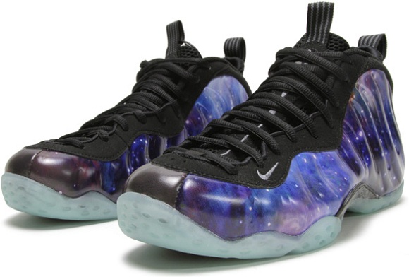
Regardless of whether they had a Swoosh or not though, one feature was always present: a solid color upper. With so much texture and depth to the upper, it was simply the best way to appreciate the design. As more and more colorways released, models started to feature different types of finishes – some glossy, and some flat. But they were always a single solid color until All-Star Weekend in 2012.
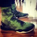
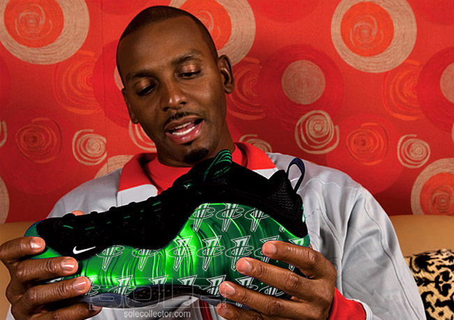
After being previewed on the feet of Gentry Humphrey at our Penny event in Las Vegas, the Galaxy Foams released for the following All-Star game. The space-themed print seemed to play into the futuristic feel of the Foamposite One and took inspiration from the host city's nearby NASA headquarters, and its release created such a frenzy that the launch was entirely cancelled for the weekend.
At times, it seems there must be a mantra at Nike which reads, "If it's worth doing, it's worth overdoing to the point no one likes it anymore." At least that may have been the plan for the 25th anniversary of the Air Force 1.
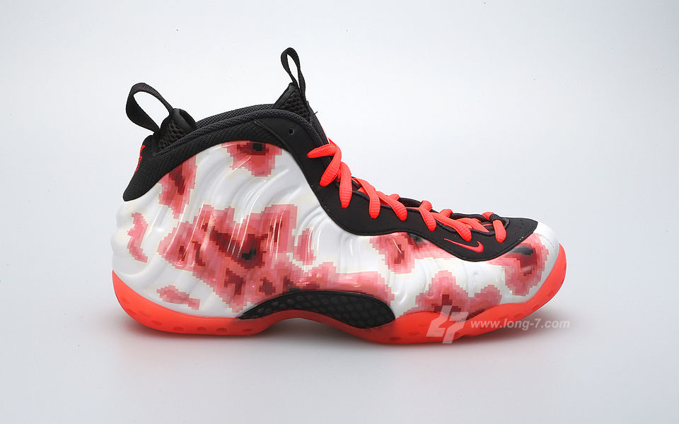
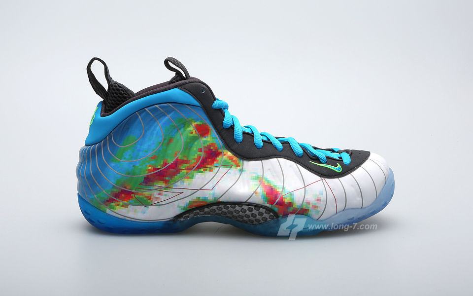
After the response to Galaxy Foams, we’ve seen prints start popping up on more and more Foamposite releases. Next up was the extra-exclusive ParaNormans, followed months later by the Fighter Jets. In recent weeks, we’ve seen leaks of the upcoming Thermal Maps, Weathermans, and Comets – all print-based Foamposite colorways. There appears to be print-based Flightposite 1s not too far afterwards on the horizon too.
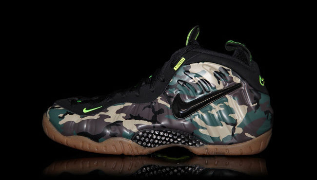
As you know, just this past weekend, we also saw the release of the Green Camo Foamposite Pros. What are your thoughts on all of the prints? Do you think they belong on a Foamposite? Are you excited to see a new approach to such a great design? Or are they hurting the legacy of a classic shoe?