words & interview // Nick DePaula
images // Steve Mullholand
All month long we've seen Nike's top tier teams battling through this season's NCAA Tournament, and while the March Madness themed Air Max Fly By became the consistent footwear story for the brand's sponsored programs, there was also quite a bit of storytelling taking place in each team's new Hyper Elite uniforms.
Sole Collector recently chatted with Nike Basketball's Global Product Director of Apparel John Nakel, Apparel Graphic Designer Nate Bush and Senior Apparel Designer Michelle Baerncopf to dive into the many changes in both construction and design that we've seen take place in their official on-court game uniforms. Read ahead for a look at how Nike Basketball's uniforms have evolved through the years to now tell a lighter and more detailed story on the hardwood.
 Nick DePaula: Can you go back a bit and talk about the building blocks of Nike’s uniform designs. How’d we get to where we’re at now?
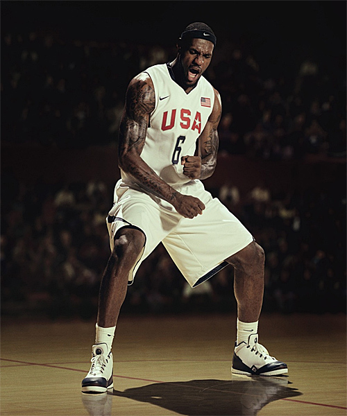
John Nakel: The big shift and big swing that we made was at the Beijing Olympics. That was when we first introduced aerographics, and the idea was that we’d have a functional graphic that helps to tell the story of a team, a federation or a country. We did those for just our top tier partners, and they were unique, curated graphics for USA, Germany and China. We incorporated things about the national team, the country itself and we worked directly with all of the teams. They loved it, because they thought it was like wearing your country’s heritage on your back. That was the aesthetic shift that we made, but there was also a shift in function. It’s lighter weight and it’s more breathable. We had to actually get some rules re-written to allow having graphics on a uniform and the amount of contrast that we were hoping for. It was new technology that was propriety to us, and we had to figure out how to burn out mesh so that we could have a contrast but also keep the structure of it. It’s almost like a paper transfer, and the whole thing starts out as a solid mesh layer, and then a layer of the panel is taken out and it opens up the holes, makes it more breathable and allows us to apply a graphic. It’s more functional, but it’s also cool looking. [laughs]
We also really wanted to take weight out of the jerseys. Uniforms had gotten to be too big, too sloppy and too heavy. A really simple way to do that was follow how all players off-court have started to get more tailored. The trend is definitely getting more towards being fitted, and we wanted to approach the jersey the same way. They can look more like superheroes this way. We took around fifteen inches in circumference out of the jersey, and that’s an easy way to lose weight, by taking that much fabric out of there. With shorts, we know we’re not going to ever go back to guys wearing short shorts.
NDP: Thanks!
[everyone laughs]
Nakel: Thanks everybody here. We joke around here that we never want to expose the male thigh. [laughs] It’s not a pretty thing. More than anything, we looked at fabric changes for the shorts. We wanted to get away from thicker and heavier meshes, and start using a lighter woven synthetic. At the time, the Beijing Olympics were considerably lighter. They were almost 50% lighter than the previous uniforms in Athens, which weren’t made by us. That was huge for us, and then, the aerographics got to be so popular that we started to incorporate them for some of our elite colleges. We had to really take a risk in doing it, because the NCAA has massive regulations. Duke was one of the first schools that rolled out aerographics. We took a historic building on campus, and had to get involved with the administration to make sure we could use it. Some people were really mad about it, saying, “Hey, that’s a church, what are you doing using that on a uniform?” So we had to be very direct in saying that we don’t commercialize that exact image, and it’s not going to be sold. When you get past that, the coaches and athletic directors came back to us and said, “You really captured the soul of the school on our back. It’s great.”
Nate [Bush] is our lead graphic designer, and he’s come up with a lot of these graphics himself and worked with other artists on some as well. A lot of it is working with the school to figure out what means the most to them. We take a shot at it and say, “Hey, this is what we think is cool,” and they might come back and say, “Well, that building isn’t really significant to us, this is the one we like.” That was the next step.
NDP: How far along before the Beijing Olympics did you guys get started on getting after more graphic-based jerseys?
Nakel: The aerographic approach is something that started around two or three years before then. The graphics have really evolved too. All of the Olympic imagery was much more symbolic. It was more organic and tattoo looking, whereas with our colleges we have architecture that’s relevant to them and words and phrases.
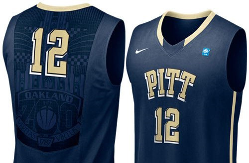 Bush: Pittsburgh is a perfect example. We sent them jerseys that had a lot of campus building architecture incorporated into the graphics. They mentioned that the student section calls themselves “The Oakland Zoo,” and that was something that was so important to them. They really consider their fans a part of their team, and they wanted “The Oakland Zoo” incorporated into their graphics instead, as a nod back to their student section and fans.
Nakel: Our schools have a lot of input on what’s included in their uniforms, definitely.
NDP: So it really became about looking at how your team could really change not only the weight and construction, but also the appearance and graphics?
Nakel: Yeah, and I wanted to take a look at where we’ve been, and compare that to where I thought we should be going. I took Gonzaga’s full uniform from just after the Beijing Olympics, which was better and lighter from where they were, but still all knit. I weighed it and together, both jersey and short, it was 1 pound, 7 ounces. Now, we have our total kit down to around 10 or 11 ounces. You have to factor in Nike Pro Combat, but we’re shaving almost a pound out of our uniforms. For us, that’s pretty significant, and now that we’re shaving a pound out, we’re looking for fractions of ounces, kind of like how footwear operates. They’re happy when they go from 12.6 to 12.5.
That’s something that has helped to influence us a lot. Footwear has gotten to be so focused on lightweight, that for the athlete, the first thing they do or ask about when they pick up a shoe, is how light it is. Light is good. In the past, people wanted something heavy from us.
NDP: That’s interesting, and I was talking to LaMarcus Aldridge once just about a bunch of stuff, and we started talking about jerseys. He said, “Man, when I was in college, it just felt like there was something there, and I had made it. Now, they’re almost too light, and it feels like a practice top.” Once you start playing in these lighter uniforms, you definitely will appreciate the difference though.
Nakel: Totally. I wear some of my heavier older mesh shorts at home just when I’m lounging around, but when I play, it’s gotta be in something like this. One of the other things that changed the weight was just the way we applied graphics. In the past, you’d have a knit taping and you’d have to sew on panels. We still have taping that looks classic, but it has an amazing contrast. It’s amazing how sharp and clean it looks now, and while the older stuff looks nicely stitched and crafted, it looks almost sloppy now.
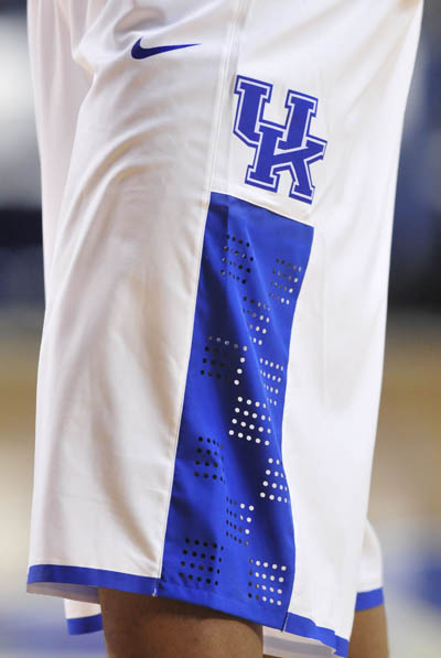
Then, last spring, we came out with the Hyper Elite uniforms, and that was a big shift for us. That’s where we literally changed the fabrication of shorts for the first time ever. As long as we’ve lived, shorts have been some sort of satin or mesh, and they’ve always been heavyweight. We used to have a saying and think that “weight is value.” You wanted to be able to pick something up and say, “Ok, I’m holding something substantial.” Now, it’s not always about heavyweight and it’s not always about lightweight, it’s more about right weight. You want something to feel authentic and real. We’ve changed fabric to a woven synthetic now, so we’re no longer a knit. It’s not rocket science that wovens are generally lighter than knits, but it was a major difference in how basketball players think.
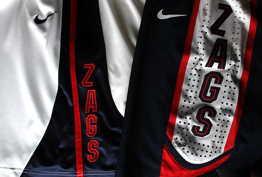
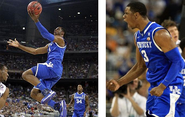 Woven shorts have been around forever in soccer shorts, but to most basketball players when we first started showing them, they kept saying it didn’t feel like a basketball short. What allowed us to make that big shift was base layer. That changed everything. When guys play ball for pickup, a lot of people might just wear boxers, but for these shorts, everybody has switched over to some sort of compression base layer. It might be padded or not, and we prefer that they’re in Pro Combat of course [laughs], but we started to look at how they could work together. At first, it was strange for people because the shorts are so lightweight, but once they put them on and had their Pro Combat on underneath, guys were really falling in love with it. Kentucky was one of the first teams last year to get into it. They’re a great barometer because they’re very open and honest -- brash even.
NDP: Good feedback from DeMarcus I’m assuming?
Nakel: Exactly. [laughs] Very open and unfiltered. [laughs] John Wall had one of the best quotes last year. He said, “This is the greatest uniform I’ve ever worn. It feels like I’m wearing nothing, but that’s a good thing.” They wore it for practices and loved it. We worked with them a lot on it, and we took their feedback and worked it into their uniform and it’s turned out great.
NDP: Unfortunately with Kentucky, none of those guys ever stay longer than a year to see the results in the next season’s uniforms.
[everyone laughs]
 Nakel: Well yeah, but now, the school looks great on-court and everyone wears everything very sharply and tailored. I think they’re the epitome of the Hyper Elite uniforms. We started with eight teams wearing it, and this year we’re rolling out more. Some teams started in it at the start of the season at the Maui Invitational Tournament, and now, all of the teams that we sent them to for spring will be wearing them in the tournament. There’s twenty-plus teams now wearing them.
NDP: Is the plan to keep the upper tier teams outfitted in the Elite uniforms, or will we see teams across the board wearing it at some point?
Nakel: The plan is certainly to spread it to everyone. If you’re a promo team and you get uniforms issued to you from Nike, we’ll plan to outfit you in Elite uniforms, definitely. We’re also working to make it available to high school teams.
Bush: Christ The King is already jumping right into the Hyper Elite uniforms.
Nakel: Some of the high schools get treated almost as well as our colleges. [laughs] The fundamental shift is also trickling down into our retail line, and kids get it now. There was a period where people were saying, “Is this a board short?” [laughs] USA Basketball and all of our federations went to it as well at last summer’s World Basketball Festival.
NDP: That was the first time I wore it, at the WBF media event in New York last summer. You know, some people didn’t have compression shorts handy, and with those open perfs on the leg, it was an awkward look for some guys.
[everyone laughs]
Nakel: With laser perforation, it allows us to take out weight and laser in some perf graphics, but we’re also relying on the color pop that you get from wearing compression shorts underneath. It almost requires you to wear compression underneath, otherwise there will be some bare leg there.
NDP: Yeah, there was a few late 20s unathletic bloggers that weren’t sure about it. [laughs]
Nakel: In some of our retail shorts, we’re easing into the transition, and we have a thin layer that backs the shorts to help prevent that.
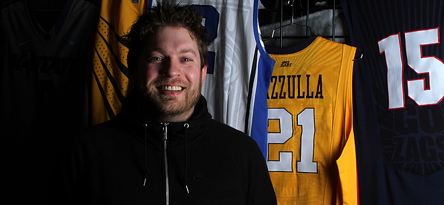
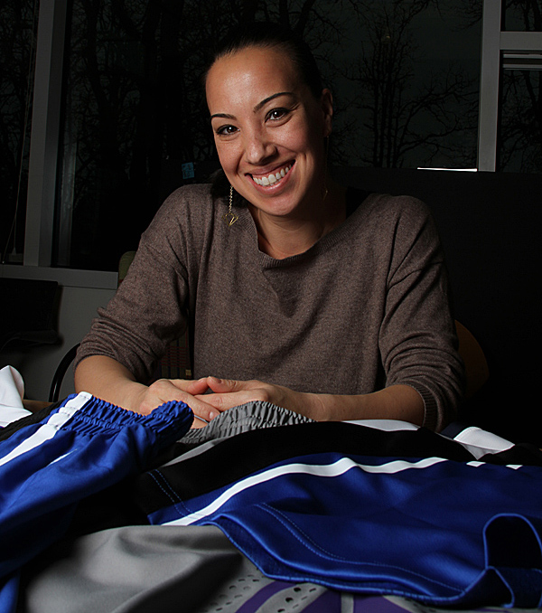
Above: Nate Bush, Nike Basketball Apparel Graphic Designer. Below: Michelle Baerncopf, Nike Basketball Senior Apparel Designer.
NDP: And you guys are also using the gel bands again in the game shorts?
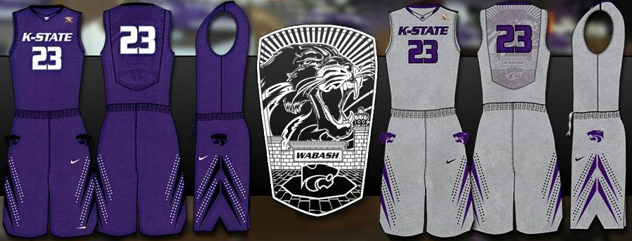
Nakel: Yeah, and that’s been a staple for our shorts for awhile now. We’re looking at how we can evolve that in the future. It’s lighter weight than just turning and stitching the fabric, and the gel helps keep your shorts up and your uniform tucked in. We’re also looking at ways now to shave some more weight out of it, and also add more details and some identity to the inside of the shorts. With all of these details designed into the back of our jerseys, whether it’s saying or just graphics that are unique to the team, we’re starting to look at how we can incorporate some of those things into the shorts to help inspire the players when they see them in the locker room. Kansas State is a perfect example of something that is unique to them with “Wabash.”
Bush: Originally we had a phrase that the student section says, and then when the coach and players saw the jersey, they mentioned that they have a word that they say amongst eachother just when they see eachother on campus. “Wabash.” Those kinds of insights that we get from the players and coaches really help us when we design, and then, the fans will get it.
Nakel: It’s nonsense to most people, but to them, that’s great.
NDP: What does it even mean?
Bush: It’s almost like how Oregon’s Football team says “Win the day.” That’s just their word that they all know to get them excited. “Wabash.”
 NDP: What kinds of challenges have you guys had to deal with?
Nakel: At first, we were just worried about the innovation and getting it on-court, and not so much worrying about commercializing it because we were interested in serving the athlete first. Now, we want to make sure that fans can get ahold of this stuff.
NDP: And you guys have gotten pretty good feedback from the fans across the country?
Nakel: Yeah, and it’s all over the place sometimes too. The aesthetics of the uniforms, when you mess with that, people can be negative. If you go more futuristic in design, the younger they are, they tend to love it, but others might not.
Bush: A lot of the success we’ve had is just from applying the aerographics into other items, like headwear, hats and t-shirts that fans can get ahold of. It doesn’t have to only be a jersey that they have access to.
Nakel: Your tailgaiting 55 year-old might not be able to pull all of this off, but we hope that the students enjoy and appreciate it. With Duke, it’s still their traditional uniform, and we knew not to change things too much for them. It’s a new fabric and application, but not a new design. We do look at some of the school messageboards, and there’s some people out there that hate them, definitely. [laughs]
NDP: Those are the best places to check. It’s all about the digital courage!
[everyone laughs]
NDP: Do you guys have a favorite?
Michelle Baerncopf: Kansas State. I really like those. I design a ton of basketball shorts. [laughs] And that’s my favorite one to date.
Nakel: I’d say you average somewhere in the neighborhood of fifty unique short designs a year between retail, in-line, Kobe, promo and team.
NDP: Wow. That’s crazy.
Nakel: And we’re starting to do Hyper Elite applications for our Kobe and LeBron shorts too, so that’s something people can look forward to. Just the lightweight notion has influenced graphics across the line for all apparel.
NDP: That’s awesome. I’ve been playing in the Kentucky shorts that came out at retail, and I really like them. The only thing is I wish they had pockets.
Nakel: Funny you say that, because that’s one of our first orders of business for next season.
NDP: Yeah, that’d be great. I really like the shorts, but I was joking with Zac [Dubasik] about it, because it’s not like a group of guys are gonna all go into Niketown, buy the Kentucky shorts and then form a serious squad somewhere. I wear them around otherwise too and pockets would be great.
Nakel: We’re looking at doing pockets so you can just wear them around casually too.
NDP: Well that'd be awesome. It was great to learn all about the uniforms. Thanks guys!