words // Nick DePaula
In today's footwear world, the approach to branding out of Beaverton is pretty straightforward: The bigger, the better.
Whether it's the massive Swooshes seen on the Kobe signature series for the last few years, or the precisely placed toe-stamped Swoosh first seen on the Hyperdunk 2012 in hoops and more recently on the KD VI, bold branding is in, and it's most likely here to stay.
Mark Parker is said to prefer the brand's logos be fully visible on-court -- on both lateral and medial sides of the shoes -- with notable instances in recent years being the late addition of a medial Swoosh to the original Hyperdunk's midfoot, and a Swoosh along the inner heel of the LeBron 8.
Parker saw a photo of LeBron just a few games into the 2010 season, seated bow-legged on the bench in an all black LeBron 8, and wasn't too pleased by the lack of branding on a guy the company pays a healthy 8-digit endorsement rate. A few weeks later, LeBron had an extra medial Swoosh on all of his shoes for the remainder of the season.
While logos on Nike Basketball's signature series increasing in size through the years haven't actually seemed to harm sales or aesthetics much at all (you could argue the trio of LeBron / KD & Kobe have never been more popular), it's hard to say the same for the Jumpman. When enlarged, the logo doesn't quite have the same flow as the Swoosh.
"We could fault ourselves in the past for not being bold enough with our brand mark," then-Jordan Senior Designer Tom Luedecke told us during the fall of 2011, just as the Jordan Q-Flight and Air Jordan 2012, both with huge logos, were releasing. "I think you’ll see going forward a resurgence of that and we’ll be more proud and more visible on the court. When you see footage of our athletes on the court, we want to be as visible as the Swoosh or Three Stripes or anything else out there."
 The large mid-flight real-life pose of Michael's that's been iconically silhouetted for nearly thirty years was pretty much universally hated on the Air Jordan 2012. The embossed Jumpman was fairly tacky to most, and it wasn't necessarily even noticeable on TV either. The game shoe was nearly entirely absent from the 2012 Playoffs, and the shoe went on to be the worst selling Air Jordan ever.
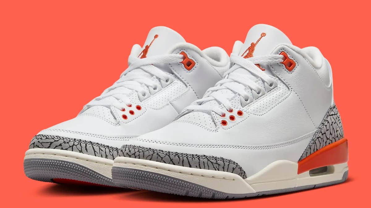
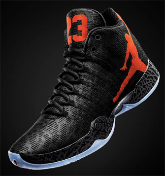
After a shift towards subtle last year for the XX8 (the shrouded height was recognizable enough), the upcoming Air Jordan XX9 features the biggest Jumpman we've ever seen on a shoe. It's so sizable that it couldn't even fully fit on the side panel -- my man's arms and legs are cut off at different angles, depending on which foot you're looking at.
While bold branding can certainly be a worthwhile design brief at times (I think it works perfectly in soccer), there's something to be said for how the brand initially defined sneakers a generation ago simply by incorporating great design and iconic court blocks into their shoes.
For Air Jordans 3 through 14 -- the ones Tinker Hatfield designed during Michael's Bulls playing days -- you could almost remove the Jumpman altogether from every single model and the design would remain largely unchanged.
Most of today's shoes would come across as bare and unfinished without their dominant brand stamps, but when he was at his best, Tinker was able to blend in that rare and perfect amalgamation of sleekened performance that always followed function, featured industry-shifting construction and materials, and had defining color splashes and court views.
There was no mistaking an Air Jordan on the basketball court.
Even as the duo of Tinker Hatfield and Mark Smith worked away in later years on the XX and XX3, that approach to branding never changed.
"The last time we got stuff back [from the factory] was when we added the Jumpman and 23 to the tongue," Smith said of the XX3's logo process back in 2008. "You could put that shoe on the table without any logos, and people knew what that shoe was. Even at the factory from the beginning, people were like, ‘Is that the XX3?’ [laughs]"
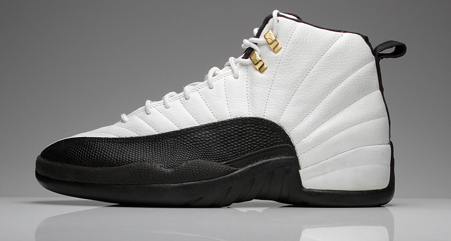
From a profile view, the Jumpman was never much larger than a quarter in a size 9 on the VII, IX and XI. The rest all featured tongue or heel branding at most, some more iconic and noticeable (think III-V) than others, but each subtle enough to let the profile's design and mix of materials be the dominant and lasting legacy of the shoe.
While the Kobe series is also certainly revered for its performance, there's something exceptionally formulaic about the 6-9 Lows. The Swoosh is so dominant through the years, that the slight midsole sculpting and heel counter differences haven't done much to really make each model feel entirely unique. While there are new themes and stories to tell each year, the base look of the shoe has largely stayed the same.
The confidence that Tinker led with on his Air Jordans, to let the design, points of inspiration, technology and performance speak for itself, has been the biggest reason why all these years later the brand is still relentlessly cashing in on the same twelve models, over and over again. The branding was always secondary to great design, which we've seen work well for every brand over time. While gigantic logos are one way to recognize an annual game shoe, there's something to be said about instantly knowing something is the Air Jordan without ever even noticing a Jumpman.